Zebra Unmasked: Behind Groton’s New Athletic Logo
Recently, after a lengthy March break, a familiar yet unknown face greeted students returning back to campus. Whether in the school store, in classrooms, or on the athletic field, a new zebra logo, with sharp mane and pensive eyes, can be spotted throughout the school. The question on everyone’s minds: why is there a new logo?
Don’t worry – the zebra will not replace the Groton crest. It is merely an athletic logo of our mascot, intended to supplement rather than replace the traditional. The next question: how did this come about?
After Chief Financial Officer Arthur Diaz introduced the concept of a new zebra logo, a committee dedicated to designing the logo formed. For months, the committee designed the logo displayed on athletic apparel today. The committee consisted of representatives from the communications, athletics, alumni relations, admissions, and business office.
The project picked up momentum when Doug Eymer, father of Groton alumnus Taggart ‘17, and the head of marketing communications and design firm Eymer Laboratory and Think Tank, first contacted the School after noticing inconsistencies in use of the zebra mascot, especially in regard to the font. His expertise in design aligned with the committee’s aim for a new zebra mascot. Together, this Groton parent and the departments worked in tandem to create the fierce zebra we see today.
To start with, the committee compiled a list of adjectives they wanted the zebra to possess: strong, graceful, dynamic, friendly, simple, and dignified. In addition, the committee compiled a list of undesirable attributes. As Director of Communications Gail Friedman said, they didn’t want the nose to be “fierce, snarling, scary, cartoonish, abstract or too contemporary.” Mr. Eymer explains that they began to clarify the “temperament and personality” that they wanted to portray with the zebra by researching animal mascots from other institutions.
Mr. Eymer presented series of mockups that considered the list of attributes. According to Ms. Friedman, there was a lot of “back and forth” with Mr. Eymer.“We went through probably twenty sets of eyes on the zebra, trying to get it just right… We had gone through many revisions, many small things like the way the G connects to the zebra’s neck.” Although Ms. Friedman said that the process was quite simple, there was a lot of communication needed between the committee and the designer, Mr. Eymer.
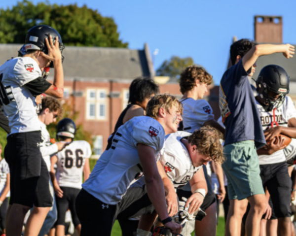
So far, the logo can be seen adorning much of the athletic apparel displayed in the School store. Peggy Duffy, who runs the store, believes that the orientation of the logo displayed on the sides of the joggers will be successful, predicting the logo will also look good placed on gear such as football helmets.
The reception to the logo among students remains mixed. Laurie Sales said that the zebra looked cute, while Lwazi Bululu ‘18 complemented its fierce gaze. Others like Brit Hyde ‘19 believes that “it looks too scary” to represent an “academic institution like Groton.” Owen Gund ‘19 says he “he likes the “G” itself, but doesn’t like the way it connects to the zebra’s neck.” Despite this, Mr. Eymer says that the mixed reaction “is to be expected, especially within a world-class institution filled with brilliant human beings.”
As athletic seasons go on, this new mascot will become more and more familiar, standing alongside the Groton shield as a symbol provoking a sense of pride. The Zebras finally have a logo to call their own.


